Histogram Maker is a free online tool that displays the histogram for given data. Our Histogram Generator displays the frequency of data points within specified intervals, these intervals are known as bins.
What is Histogram?
A histogram is a graphical representation of the distribution of quantitative data. It is a bar chart where the x-axis represents the data values grouped into intervals (bins), and the y-axis represents the frequency or count of data points falling within each interval.
How to Make a Histogram?
Follow the below steps to create a histogram manually.
- Build a Frequency Table: Divide your data into equally spaced intervals and count how many data points fall into each one.
- Add Titles and Labels: Name your histogram according to the data or context. Label the horizontal axis with the intervals and the vertical axis with frequency
- Plot the Histogram: Draw bars above each interval on the X-axis to represent the frequency of data points in that interval.
Moreover, use our above Histogram Generator to generate the histogram by just entering the data in the given input fields.
Types of Histograms
Histograms can be categorized based on the frequency distribution of the data they represent. There are many types of distribution including normal skewed, bimodal, multimodal distributions, and so on.
These different distributions can be effectively signified using histograms. The types of histograms are as follows:
Uniform Histogram
In this type of histogram, all bins have approximately the same frequency. This means the data is equally distributed across the range.
Bimodal Histogram
A bimodal histogram has two distinct peaks. This indicates that the data might come from two different populations.
Symmetric Histogram
This type of histogram is also called a bell-shaped histogram. In this, data is evenly distributed around the central value. It shows the mean, median, and mode will be the same and located at the center of the distributions.
Examples of Histograms
This section will explain how to create a histogram with the help of examples. Each example provides unique insights depending on the nature of the data and the specific analysis being performed.
Example 1
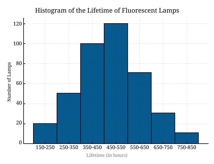
The below table gives the data for the lifetime of 400 fluorescent lamps. Create a histogram graph for the following data:
Lifetime (in hours) | Number of Lamps |
150-250 | 20 |
250-350 | 50 |
350-450 | 100 |
450-550 | 120 |
550-650 | 70 |
650-750 | 30 |
750-850 | 10 |
Solution
The histogram result for the given data is:

Example 2
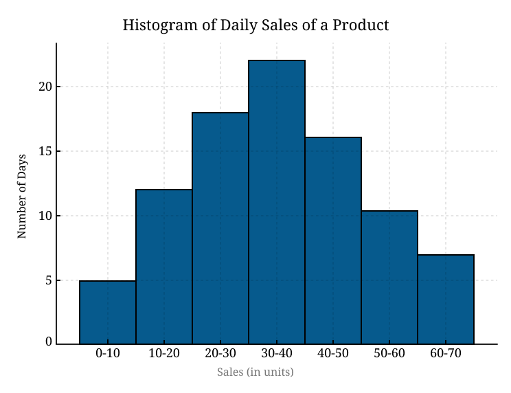
Consider the daily sales of a particular product in a store over time. Make a Histogram for the given data
Sales (in units) | Number of Days |
0-10 | 5 |
10-20 | 12 |
20-30 | 18 |
30-40 | 22 |
40-50 | 16 |
50-60 | 10 |
60-70 | 7 |
Solution
Below is the histogram result to visualize this data easily.

To verify the above histogram results use our above Histogram Maker that creates the Histogram of any data easily.
Frequently Asked Question
What is the difference between a bar graph and a histogram?
There are two main differences between a bar graph and a histogram:
Bar Graph | Histogram |
The bar graph shows categorical data. | Histogram represents numerical data (discrete or continuous data). |
Equal space between every two consecutive bars. | In the histogram no space between two consecutive bars. They should be attached. |
What is the use of a histogram?
A histogram is used to show the distribution of data, such as the relative frequency of numbers of different sizes.
What is the main advantage of histograms?
Among the most advantages, one is histogram allows you to see the frequency distribution of a data set in easy pattern.


