
Understanding the Standard Deviation Graph
Standard deviation is a mathematical measure that is used to represent the variation of the data around the mean or average of the given data set. For the representation of the data use the graph, this graph is known as the standard deviation graph. This graph visualizes the spread of data effectively.
Two types of deviations are represented on the standard deviation graph, one is positive which is shown on the right-hand side of the mean on the graph. The other is negative which is shown on the left-hand side of the mean on a graph.
To learn more about the graph, continue your reading. In this blog, we will discuss the definition of standard deviation and the importance of the standard deviation graph.
Also discuss how to draw a graph of standard deviation with different techniques and find the standard deviation from the graph. Moreover, discuss some practical examples to explain SD-graph in different scenarios.
What is Standard Deviation and its visualization?
It is a statistical measure that is found by using the data set values. The standard deviation is simply represented by the alphabetical symbol “SD”. SD-value tells the variation/separation of the data along the mean or average value of the given data set.
The standard deviation has two types, due to the size of a data set known as Sample and population standard deviation. The sample standard deviation is shown by the symbol “S” and the population Standard deviation is represented by the Greek letter “σ”. Both formulas are shown in below picture:
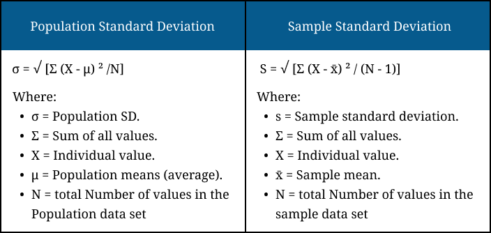
The numerical value for the population and sample data is found separately with the help of the formula of population and sample respectively. The standard deviation low value shows the variation/separation of data near the meanwhile its high value shows separation of data away from the mean.
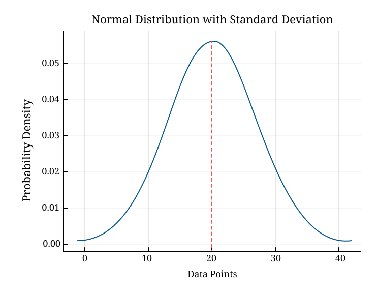
For clarification of this, the visualization of the data is necessary, so we use the standard deviation graph for this purpose. The graph shows a narrow/flatter curve. Due to the shape of a graph, the standard deviation graph is also known as the bell curve graph.
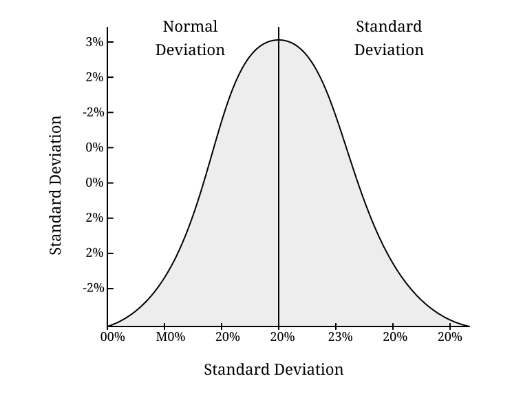
The narrow curve shows points where data points are close to the mean. In contrast, a flatter curve shows more variation in the data and a high standard deviation value.
Importance to Visualize Standard Deviation on Graph
The visualization of the standard deviation on a graph is essential to understanding the distribution of data points around the mean. The graphs show how much the data is clustered around the mean of data. Some of the reasons are discussed below:
- It helps to assess the variability of the dataset quickly. Its visual shows the data points are tightly/widely clustering to the mean.
- The graphs display standard deviation, identify the patterns, outliers, and data consistency. All these things make it easier to interpret trends or irregularities in both population and sample data.
- This visualization is important in finance, research, and quality control. It helps to make informed decisions by understanding the separation of data.
How to Find Standard Deviation on a Graph?
If data set values are not given to find the standard deviation. However, the graph is provided in the form of a normal distribution or bell curve, with or without an explanation of the mean and other data values.
To find the standard deviation value with the help of a graph, note the deviation point on the graph. To determine standard deviation from graph follow the below steps:
- Locate Mean: First, locate the mean on the graph. It is the highest point of the curve and is placed at the center of the data.
- Note Curve Points: Locate the curve points around the mean where values deviate. A narrow curve means low standard deviation and a wide curve means high standard.
- Draw Perpendicular: Draw a perpendicular line on the horizontal axis from the points to where the curve deviates to determine the standard deviation.
- Measure Distance: Measure the distance of the points from the origin to the point that cut the horizontal axis and subtract the mean from these values for the required
standard deviation.
See the below examples for the clarification of the above points.
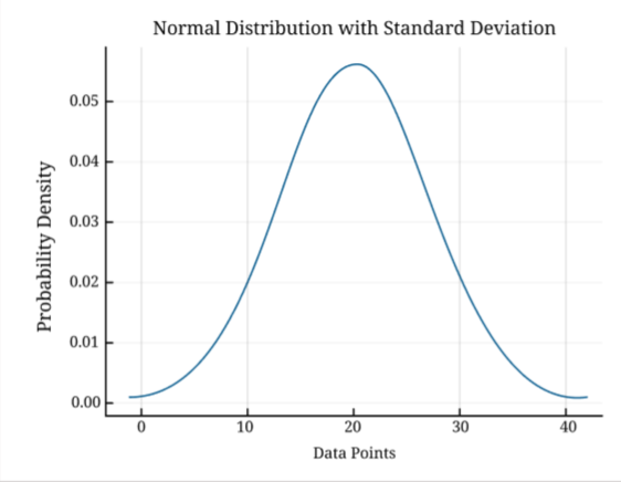
Example: Find the standard deviation from its graph that is given below.
Solution:
Step 1: First note the mean from the graph.
We know that the mean is placed at the center of the graph. Thus, the mean is 20 and represented by the red line.
Step 2: Draw a perpendicular line on the horizontal axis from the curve points.
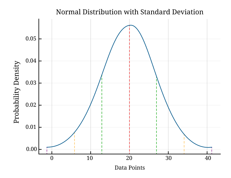
Step 3: Note the distance from the origin of the point that cut the x-axis.
We observe that the curve flattened around 27 and 13, and the standard deviation is equal to “7”. Because the difference of both numbers is 7 i.e., “27 - 20 = 7 and 20 - 13 = 7”.
How to Show Standard Deviation on a Graph?
The standard deviation is displayed on the graph after finding its exact value. First, set the data values on the graph then set the standard deviation on the graph. Displaying the standard deviation on a graph helps to visualize the separation of data.
Follow the below step-by-step explanation to plot the standard deviation on the graph.
Steps to Plot Standard Deviation on Graph
To plot the standard deviation on the graph, first find its value. To determine the SD value manually follow the below steps. Alternatively, use the standard deviation calculator for accurate and quick results.
- Collect data: First collect the data from the given population/sample data set.
- Find Mean (Average): Now, calculate the mean of the given data set by adding all the data points and dividing by the total number of points.
- Calculate Standard Deviation: Use the formula of standard deviation for a sample or population data set to calculate its value.
- Plot Graph: Highlights the data points on the horizontal axis (X-axis) and the frequency or occurrence on the vertical axis (Y-axis). The mean of data is shown in the middle of the graph.
- Show Standard Deviation: Match all points to plot a bell curve (normal distribution) and show standard deviation on a graph that indicates the spread of data points around the mean.
For a better understanding of the above steps see the below examples.
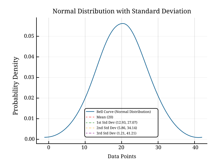
Example: Find the Standard deviation of population data {10, 15, 20, 25, 30} and plot it on the graph.
Solution:
Step 1: Note the data set from the given question and find its mean.
Data set = {10, 15, 20, 25, 30}
μ = 10 + 15 + 20 + 25 + 30/5 = 20
Step 2: Now, calculate the standard deviation with its formula.
σ = √ Σ(X - μ)²/N
= √1/5{(10−20)2 + (15−20)2 + (20−20)2 + (25−20)2 + (30− 20)2}
= √1/5 (100 + 25 + 0 + 25 + 100)
σ = √250/5 = 7.07
Step 3: Plot the graph by highlighting the data point on the x-axis and frequency/probability on the y-axis.
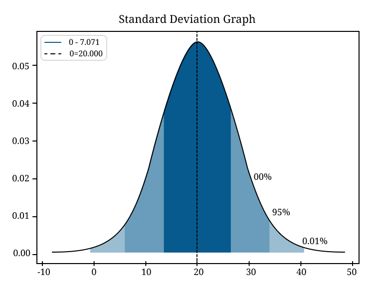
The standard deviation is placed at the places of 13 and 27.
Note: The value of the standard deviation shows the variation of data is high or low, around its mean. To know more about the high or low value read below details.
High vs. Low Standard Deviation Graph
Just by visualizing the graph value we predict that the value of the Standard deviation is high or low. If the curve flattening part is low then it represents the low value, while the high value is the converse of it. For more clarification see the below details:
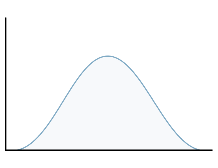
High Standard deviation and its graph
The standard deviation shows the dispersion of the data around the mean of the distribution of data. The high value shows the data are more scattered around the mean of the data and the curve is more flat or widespread. See the below picture:
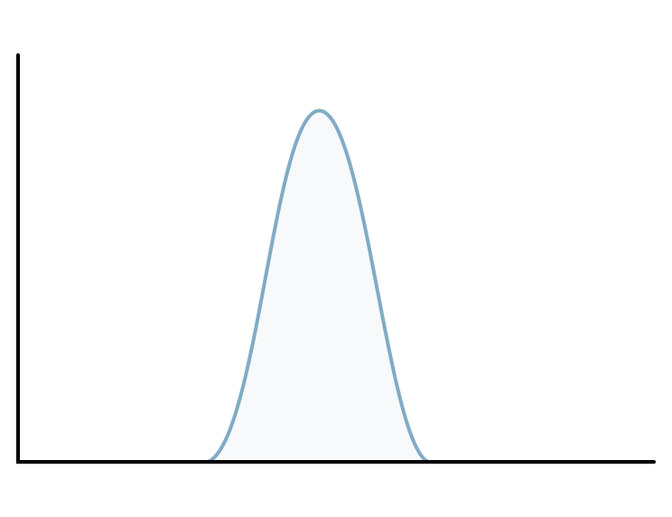
Low Standard deviation and its graph
The low value shows the data is closely packed around the mean of data and the curve is a high peak. However, the separation of data is small. For clarification see the below picture.
The high and low standard shows the variation of the data and give remarkable results. It has an impact on the shape of the graph. Read the below analysis that shows the detailed impact on the shape.
Analysis How Variation Impacts Shape of Graph
In statistics, variation shows how the data are spread or dispersed around the mean. The amount of variation significantly impacts the shape of the graph, particularly in a normal distribution or bell curve. The two types of variation occurred in a graph, i.e., low and high variation.
Let’s explore how variation affects the graph:
Low Variation (Low Standard Deviation) | High Variation (High Standard Deviation) |
| The data points are close to the mean, which leads to a narrow and steep bell curve. | The data points are more spread out from the mean, resulting in a wider and flatter bell curve. |
| In this case, data points cluster tightly around the mean. The curve rises sharply and falls sharply which shows values are not spread out much. | It shows the curve will have a more gradual slope. The curve will be wider and flatter which shows the values are less consistent and more spread out. |
| For Example: In a production process where the product size is highly controlled, the SD will be small, and the curve will be narrow. | For Example: In a diverse population, measuring human heights and observing a higher variation, leads to a flatter and wider bell curve. |
Advanced Methods to draw a Standard Deviation Graph
To make the standard deviation graph use the above manual methods. However, the manual method is long and time-consuming. For ease, there are many online methods to plot the standard deviation graph quickly. Some methods are discussed below:
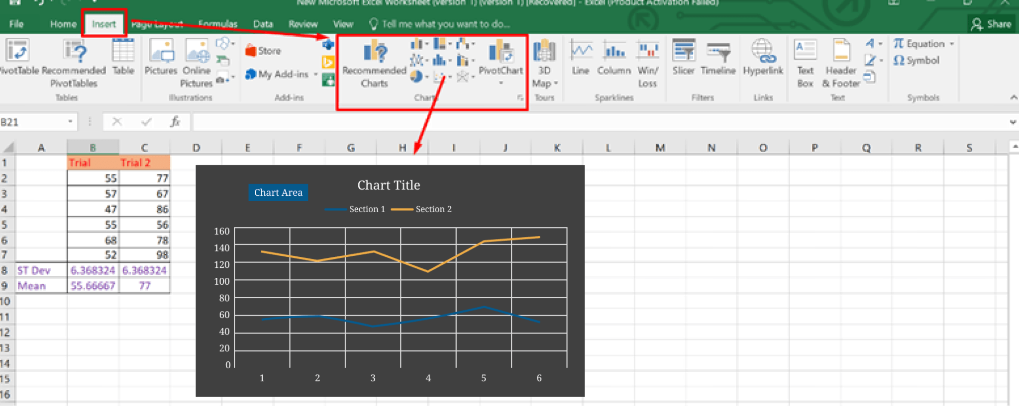
- Using Microsoft Excel: Excel makes any type of graph such as a Standard deviation graph, Bar graph, Histogram, or Pie Chart graph in 2D, 3D, and many other formats. Open the Microsoft Excel sheet and enter the data in table form. Then click on the insert option and locate the chart section. Select the Scatter type of graph and add mean values on the X-axis and standard deviation for the Y-axis.
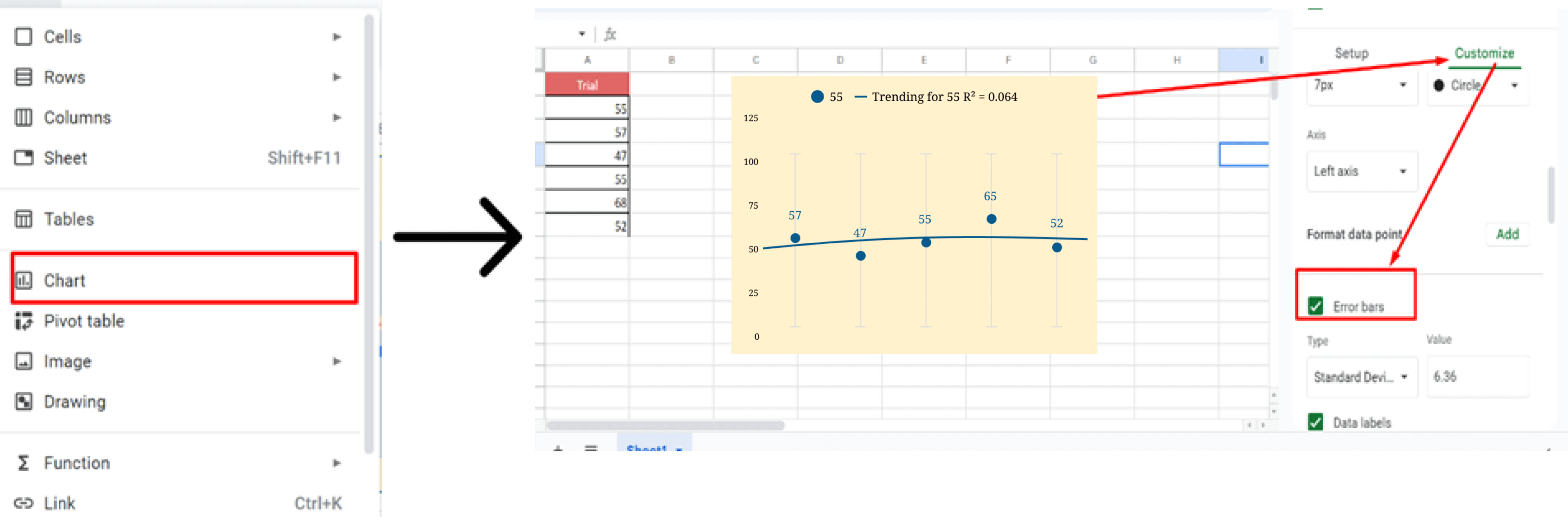
- By Google Sheets: Google Sheets helps to make different types of graphs. Open the spreadsheet on your browser, enter the value, press the insert button, and select the chart option.
Use the edit option, then press on the customize tab, and select Series. Next, click the error bars box, and select standard deviation from the drop-down menu under Type.
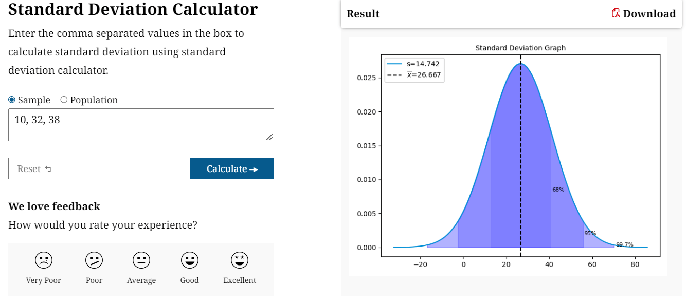
- Using online Standard Deviation Calculator: It is a simple and easy method. It helps to find the SD-values and draw its graph according to the data. Enter the data separated with commas and press the calculate button. It provides the SD-value and shows the graph of standard deviation in bell curve form.
Practical Example of Standard Deviation Graph
The standard deviation has many applications in various fields like finance, quality control, Sports Analytics, Education, and many more. Which helps in the analysis of data from its variation or separation.
Similarly, the standard deviation graph has a practical example in all these fields to demonstrate the concept visually. The explanation is given below:
- Finance: Standard deviation is used in finance to measure the risk and volatility of investments, stock prices, and portfolios. A standard deviation graph shows an investment’s returns visually and low volatility meaning the returns are more consistent. While high volatility is the converse of it, which implies higher risk.
- Quality Control: The standard deviation graph ensures that products meet specific quality standards by measuring the consistency of production. A small standard deviation, ensuring products meet specifications and reducing waste or defects.
- Sports Analytics: In sports, helps to analyze player performance visually. The team consistency, and other metrics to understand variability in performance levels.
- Education: In education, it helps to assess the spread of a student’s performance in exams or other assessments. A high standard deviation might suggest that the test was too difficult for some students. It can also be used to normalize scores and ensure a fair distribution of grades.
Conclusion
Understanding a standard deviation graph is essential for analyzing the variation of data around the mean. The graph represents the separation of data effectively, with positive and negative deviations indicated on either side of the mean.
With the help of this blog, learned about standard deviation, its visualization, and the importance of the standard deviation graph in various fields like finance, quality control, and education. How the visualization of standard deviation from the graph helps to assess the data variability and data consistency.
Furthermore, various methods can assist in creating standard deviation graphs efficiently such as Microsoft Excel, Google Sheets, or online Standard deviation calculator. The practical examples of standard deviation graphs in different fields highlight the importance of visual representation of data variations and help to make informed decisions.
